


What Keeps Tattoo Color Saturation Bright

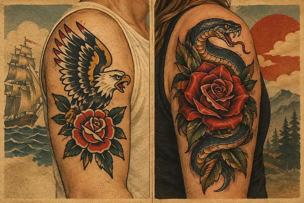
A bright red rose, a deep green panther, a clean yellow flame - these tattoos work because the color reads from across the room. Tattoo color saturation is the difference between color that looks confidently packed in and color that feels thin, patchy, or washed out before its time. It is a big part of what gives traditional tattooing its staying power.
Saturation is not just about choosing loud colors. It comes from solid design, deliberate application, the right placement, healthy healing, and realistic expectations about your skin. A good tattoo should look good when it is fresh, but the real standard is how it settles in and holds up.
What Tattoo Color Saturation Actually Means
In tattooing, saturation means how fully and evenly pigment is placed in the skin. A saturated tattoo has color that appears dense, consistent, and intentional. It does not mean every tattoo needs to be neon-bright or packed wall-to-wall with every color on the palette.
A bold design can be mostly black with a few strong color accents. A classic tattoo may use red, yellow, green, and blue in clear, well-separated fields. What matters is that each area has enough visual weight to do its job. When colors are thoughtfully chosen and solidly applied, the tattoo stays readable as it becomes part of your skin.
This is one reason traditional designs continue to look so good over time. Strong outlines create structure. Clear color groupings create contrast. Simple, recognizable shapes do not depend on tiny transitions or subtle details that can soften as the tattoo ages.
Bright Color Starts With the Design
The most saturated tattoo in the world can still look weak if the design has no contrast. Colors need room to breathe. A red heart framed by black linework will usually read more clearly than several similar warm tones blended tightly together. Yellow needs a darker neighbor to show its brightness. Blue and green need separation when they sit side by side.
Skin is not a blank white page, either. Your natural skin tone becomes part of the final image. The same ink can appear different from person to person, and that is normal. A skilled artist plans around it instead of promising that every reference photo will translate exactly the same way.
For clients, this is a useful shift in thinking: bring references for the feeling, composition, and color direction, not as a demand for an exact copy. A tattoo can be custom to you while still following the design rules that make it last.
More Color Is Not Always Better
There is a trade-off between complexity and clarity. Adding extra shades can create depth, but it can also crowd a design. On a small tattoo, too many colors may fight each other and make the image harder to read from a distance.
Sometimes the stronger choice is fewer colors, used with confidence. A limited palette gives each shade a clear role. It also makes the tattoo feel more unified. This is especially true for palm-sized flash, walk-in tattoos, and designs meant to look crisp for decades rather than merely detailed on day one.
Size Gives Color Room to Work
Color needs enough space for clean application and clear visual separation. A large eagle can carry multiple tones across its wings, body, and banner. A tiny eagle may need to be simplified into a few bold shapes. Neither approach is lesser. They are different designs with different jobs.
If your heart is set on a detailed color piece, be open to making it larger or choosing a placement with more usable skin. That conversation can save you from a tattoo that feels overcrowded from the start.
Placement Changes How Color Holds Up
Some areas of the body see more sun, friction, movement, and daily wear. That does not make them off-limits. It simply affects how you should plan the design and care for it.
Hands, fingers, feet, and areas that rub against clothing often need a bolder approach and may need touch-ups over time. Elbows, knees, and other high-motion spots can be challenging because the skin bends and shifts constantly. A design with strong outlines and generous color fields generally has a better chance of staying legible there than something delicate and densely detailed.
Sun exposure is another real factor. UV light can fade tattoo pigment over time, particularly in exposed placements like forearms, shoulders, and calves. If you spend a lot of time outdoors in the Bay Area, sun protection is not optional if keeping color bright matters to you.
The best placement is still one you are excited to wear. Just let the placement inform the scale, color choices, and level of detail. Good planning beats wishful thinking.
Application Makes the Difference You Can See
Saturation is earned during the tattoo, not added afterward by a special ointment or a trick of lighting. The artist needs to place pigment evenly at the proper depth while respecting the skin. Rushing, overworking an area, or trying to force a design beyond what the skin can support can create problems that no aftercare routine can fully fix.
This is why artist selection matters. Look beyond a freshly finished tattoo photo, where color is naturally at its loudest. Healed work tells a more useful story. You want to see clean edges, even fill, clear contrast, and tattoos that still have presence after the initial shine is gone.
At Good Tattoo, bright, bold work is built around that standard: color and linework should hold their ground, not rely on a fresh-tattoo glow to make an impression.
Healing Protects Your Tattoo Color Saturation
The first few weeks set the foundation for how your tattoo settles. Your artist’s specific aftercare instructions come first, because methods may vary based on the work, placement, and your skin. The basic goal is consistent: keep the tattoo clean, avoid overdoing products, and leave it alone while it heals.
Do not pick flakes or scabs, even when the tattoo looks uneven during the peeling stage. That stage can be alarming, especially with solid color. It is common for a healing tattoo to look cloudy or dull for a while as fresh skin forms over it. Give it time before judging the final result.
Avoid soaking the tattoo in baths, pools, hot tubs, or open water while it is healing. Skip direct sun, hard friction, and tight clothing that repeatedly rubs the area. Use a clean, breathable layer of clothing when you need coverage.
Once the tattoo is fully healed, regular moisturizing can help your skin look healthy and keep the design looking its best. It will not replace pigment or reverse aging, but hydrated skin usually presents tattoo color more clearly than dry, neglected skin.
The Long Game: Sun, Skin, and Touch-Ups
Every tattoo changes with time. Skin changes, bodies change, and sun exposure adds up. That is not a failure of tattooing. It is part of wearing art on a living surface.
Daily sunscreen on exposed tattoos is one of the most practical ways to preserve color. Use broad-spectrum sunscreen, apply enough, and reapply when you are outside for extended periods. A shirt or jacket provides even more reliable protection when the sun is intense.
Touch-ups can also be part of responsible tattoo ownership, especially for high-wear placements or tattoos that have had years of sun exposure. They are not automatically needed, and they should not be expected right after normal healing. Let the tattoo settle, assess it honestly, and talk with an artist if an area has truly lost consistency.
The goal is not to chase the look of a tattoo from the first ten minutes after it is finished. The goal is a tattoo with enough strength in its design, application, and color choices to keep looking like itself. Choose the colors you love, give them room to work, and treat the healed tattoo like something worth keeping bright.


Comments