


Bold Tattoos Versus Minimalist Designs Compared

A tattoo does not live in a flat Instagram post. It moves with your body, catches light differently, and changes over decades. That is where bold tattoos versus minimalist designs becomes more than a style preference. The real question is what kind of image you want to carry, how clearly you want it to read, and whether it will still feel like yours years from now.
There is no wrong answer between a tiny fine-line mark and a saturated traditional piece. But they ask different things of the skin, the artist, and the person wearing them. Knowing the trade-offs before you sit down makes for a better tattoo and a better day at the shop.
Bold Tattoos Versus Minimalist Designs: The Real Difference
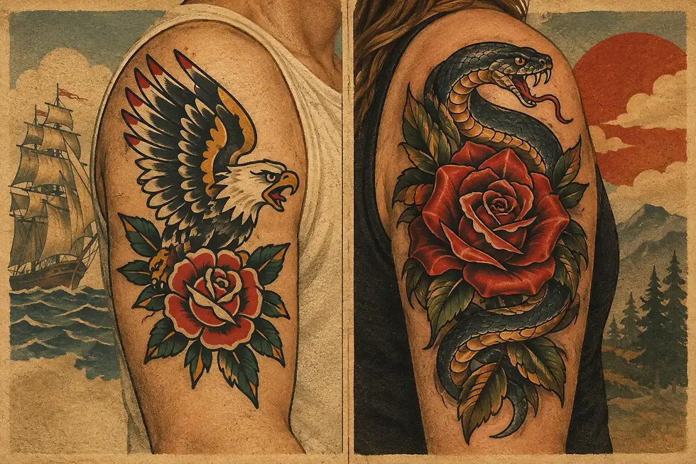
Bold tattooing is built for readability. Strong outlines, clear shapes, deliberate color, and solid black areas give a design structure. Traditional tattooing has relied on those tools for generations because they work. A panther, rose, eagle, heart, dagger, or custom symbol does not need a long explanation when the design is drawn with confidence.
Minimalist work takes the opposite approach. It gets its impact through restraint: a small word, a single fine line, a tiny object, or a subtle shape placed in a quiet part of the body. When it is well designed, it can feel personal without asking for attention. It can also leave room for a collection to grow gradually.
The difference is not simply loud versus quiet. It is visual information. Bold tattoos simplify an idea until it can be understood quickly. Minimalist tattoos often depend on intimacy and detail. One is designed to hold the room. The other may be designed to reward a closer look.
For many people, the best choice comes down to how they dress, what they already wear, and how they want the tattoo to function. A visible, colorful piece can become part of your everyday look. A small design can feel like a private marker. Both can be meaningful. Both deserve solid drawing and clean application.
How Each Style Ages on Skin
Skin is not paper. Lines spread slightly over time, pigment settles, and areas that bend, rub, or see constant sun tend to show more wear. A good artist plans for that reality instead of pretending it does not exist.
Bold designs usually have an advantage here. Their outlines have room to breathe, their shapes are separated, and their color or black shading creates contrast. Even after the natural softening that comes with age, a well-made bold tattoo often keeps its basic read. That is a major reason traditional tattooing has such staying power.
Minimalist designs can age beautifully, but they require more care in the drawing stage. Tiny lettering needs enough space between characters. Fine lines cannot be packed too tightly. Small details need to be chosen carefully because a design that looks crisp on day one can become visually crowded later.
This does not mean every small tattoo will blur into a mystery mark. It means size needs to match the amount of information. If you want a tiny tattoo, keep the concept simple. If you want detailed faces, dense script, delicate florals, or intricate geometry, give the design enough room to do its job.
Placement matters just as much. Hands, fingers, feet, and areas exposed to frequent friction may need touch-ups sooner than an upper arm, thigh, or calf. Fine-line work in high-wear placements can be especially demanding. A good consultation should include an honest conversation about what is possible, what may change, and whether a slightly larger design will serve you better.
Choose the Design Before You Choose the Trend
Trends can be a useful starting point. They should not be the whole plan. The strongest tattoos look intentional because they fit the person wearing them, not because they copied the most recent scrollable style.
Start with the image rather than the label. Do you want a tattoo that feels graphic, immediate, and built to be seen across a room? Bold work may be the right direction. Do you want a smaller gesture, a quiet reference, or a design that sits close to the body without becoming the center of your look? Minimalism may make more sense.
Then ask how much detail the idea actually needs. A tiny lightning bolt needs very little. A memorial concept involving a landscape, handwriting, dates, and multiple symbols may need more space or a more edited approach. Editing is not losing meaning. It is often how a tattoo becomes stronger.
A skilled artist can help simplify a busy reference without stripping away what matters. They can also tell you when an apparently simple tattoo needs to be larger, darker, or moved to a better spot. That advice is not a sales pitch for more tattoo. It is part of making sure the tattoo has a future.
When bold makes more sense
Bold work is often a natural fit for people who want a statement piece, are building a sleeve or larger collection, or love the visual language of classic tattooing. It also works well for motifs that need instant recognition: animals, flowers, symbols, emblems, and designs with strong emotion behind them.
It can be especially satisfying for a first tattoo because the design is clear and the visual result is immediate. You do not need tattoo knowledge to understand why a bright red rose with a black outline works. It is direct, durable, and hard to mistake for anything else.
When minimalist makes more sense
Minimalist work can be right when the scale is genuinely part of the idea. A small initial, a simple star, a restrained botanical shape, or a compact icon can feel complete without needing more decoration. It may also suit someone who wants tattooing to enter their personal style quietly.
The key is not to force a big concept into a tiny space. If the design relies on delicate precision, choose an artist whose healed work shows they understand line weight, spacing, and placement. Small tattoos still deserve a full design conversation.
Color, Blackwork, and Visual Commitment
People sometimes treat color as the dividing line between bold and minimal. It is not. A tiny tattoo can use color, and a large tattoo can be black and gray. The real issue is contrast.
Bright color and solid black can make a design read from a distance. They also create a clear hierarchy: what you notice first, what you notice second, and what supports the main image. That structure is why a classic tattoo can look clean even when it contains several elements.
Minimal designs often rely on negative space instead. That can be beautiful, but it leaves less room for errors in placement or proportion. The quieter the tattoo, the more each line has to earn its place.
Think about your long-term comfort with visibility, too. A bold tattoo is a commitment you will see often and that others may notice quickly. That is a feature for some people and a drawback for others. Minimal work can feel easier to place discreetly, but subtle does not automatically mean low commitment. A tattoo is still permanent, whether it is the size of a coin or the size of your palm.
A Better Way to Decide
Do not decide from a single reference photo. Save examples for a few weeks and look for what keeps showing up. Are you drawn to crisp outlines, dense color, and familiar tattoo imagery? Or do you keep returning to small, airy, understated marks? Your repeated choices are usually more useful than your first impulse.
Next, look at tattoos on actual bodies, including healed work. Fresh tattoos are exciting, but healed photos tell you more about line quality, saturation, and how a design settles into skin. Consider the body part, the available space, and whether you might want to add more tattoos around it later.
At Good Tattoo, that conversation can happen around a planned custom appointment or a walk-in idea that is ready to go. Bring a clear concept, stay open to practical guidance, and choose work that has the right scale for the image. Good tattoos are not accidents of trend or luck. They come from strong design, capable hands, and a decision you can stand behind.
The best tattoo is not the boldest or the smallest one. It is the one that still looks intentional when the novelty wears off and still feels good when you catch it in the mirror years from now.


Comments